Give the gift of life-changing education! Donate Now!
6.1- DATA ANALYSIS WITH GRAPHS
6.2 MEASURE OF CENTRAL TENDENC
It is often convenient to use a central value to summarize a set of data. There are several different ways to find values
around which a set of data tends to cluster. Such measures are known as Measure of Central Tendency .
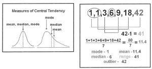
Mean– the sum of the values of a variable divided by the number of values. Some times the mean is also referred
to as the average. \(\frac{\sum x}{n}\) (the symbol ” p” is used for a population and x̄ is used for sample)
Median – the middle value of the data when they are ranked from highest to lowest. When there is an even
number of values, the median is the midpoint between the two middle values.
Mode – the value occurs the most frequent in a distribution. Some distributions do not have a mode, while others have several.
Outliers – the value(s) that are distant from the majority of the data. Outliers have a greater effect on the mean than on the median when the sample size is small.
Weighted Mean –Weighted mean is a kind of average. ln stead of each data point contributing equally to the final mean, some data points contribute more “weight” than others.
Mean For Grouped Data
6.3 – MEASURES OF SPREAD
The measures of spread or dispersion of a data set are quantities that indicate how closely a set of data clusters around its center. Just as there are several measures of central tendency (mean, median, mode), there are also different measures of spread.
A deviation is the difference between an individual value in a set of data and the mean for the data.
Population Deviation = x – µ
Sample Deviation= x – x̄
Note: If we simply add up the deviations for a data set, they will add to zero.
Standard deviation is indicative of the spread or dispersion of the distribution of a random variable. It is the average deviation of the data values from the mean. It is also the square root of the mean of the squares of the deviations. The lower case Greek letter sigma, or a, is the symbol for the standard deviation of a population.
Population Standard Deviation for Ungrouped Data

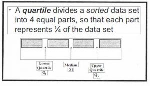
Quartiles and Interquartile Ranges

Note :
• If Cb is even take mean of two middle data. (e.g. Cb is 10th value would take the average between the 10th and 11th value.)
• If Qi is even take mean of two middle data. (e.g. Qi is 5th value would take the average between the 5th and 6th value.)
Interquartile Range is the difference between Q3 and Q1. It is the range of the middle half of the data. The larger the IQR, the larger the spread of the central half of the data. IQR provides a measure of spread.
INTERQUARTILE RANGE= IQR = Q3-Q1
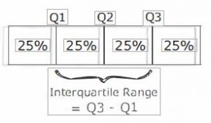
Semi-interquartile Range (SIQR} is one half of the IQR. Both the IQR and SIQR indicate how closely the data are clustered around the median.
BOX-AND-WHISKER PLOT (Boxplot) is a graphical representation of the quartiles. The box shows the first, second and third quartile. The ends of the “whiskers” represent the highest and lowest values in the set of data. Thus, the length of the box shows the interquartile range, while the left whisker shows the range of data below the first quartile, and the right whisker shows the range above the third quartile.
MODIFIED BOX-AND-WHISKER PLOT is often used when the data contains outliers. By convention, any point that is at least 1.5 times the box length away from the box is considered an outlier and is represented by a dot. This usually gives a clearer illustration of the distribution.
Percentiles: Percentiles are similar to quartiles, except that percentiles divide the data into 100 intervals that have equal number of values. Thus, k percent of the data are less than or equal to the kth percentiles, Pk and (100 – k) percent are greater than or equal to Pk.
Z-SCORES : A Z- scores is the number of standard deviations that a datum is from the mean. You can calculate the z-score by dividing the deviation of a datum by the standard deviation.
6.4-SCATTERPLOTS AND LINEAR CORRELATION
CORRELATION refers to the relationship or association between two variables. There are many characteristics to consider when describing the correlation between two variables: direction, linearity, strength, outliers and causation.

![]()
LINEARITY : We determine whether the points follow a linear trend or in other words approximately form a straight line.
STRENGTH : We want to know how closely the data follows a pattern or trend. The strength of correlation is usually described as either strong, moderate, or weak.

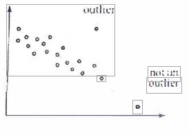
OUTLIERS : We observe and investigate any outliers. or isolated points which do not follr.1w the trend formed by the main body of data.
if an l1utlicr is the result of a recording or graphing error. it should he discarded. I Howcvcr. if the outlier proves to be a genius piece of data. it should be kept.
CAUSATION : Coordination between two variable docs not necessarily mean that one variable causes that other.
6.5 – LINEAR REGRESSION
REGRESSION is an analytic technique for determining the relationship between a dependent variable (y-value) and independent variable (x-values).
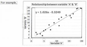
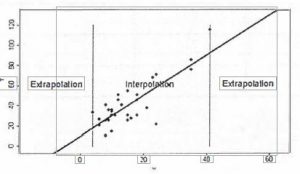
When two variables have linear correlation, you can develop a mathematical model of the relationship between the two variables by finding a line of best fit. You can then use the equation for this line to make predictions by interpolation and extrapolation.
The equation for the line of best fit is given by:
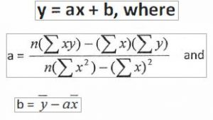
Note: The “line of best fie “is also known as the “least squares line”